- Joined
- Mar 13, 2018
- Posts
- 35,166
- Solutions
- 330
- Reaction
- 129,287
- Points
- 22,178

If you take a look at Apple’s famous logo design, you might notice a curved piece missing. It’s a bite mark in the fruit—but why is it there? We’ll explain the history and meaning behind the bite.
It Makes the Apple Shape Obvious
To develop the company’s early branding, Apple Computer, Inc. hired the Regis McKenna ad agency in 1977 (with a relationship that You do not have permission to view the full content of this post. Log in or register now.). McKenna himself assigned the task of designing Apple’s logo to You do not have permission to view the full content of this post. Log in or register now., a graphic designer who worked for the firm.According to a You do not have permission to view the full content of this post. Log in or register now. with Forbes, Janoff described the unique thematic opportunity provided by the contrast between a machine and a natural piece of fruit. “I just wanted to make the computer easy and fun to be around,” he said, and he thought including the approachable image of an apple fruit was a must.
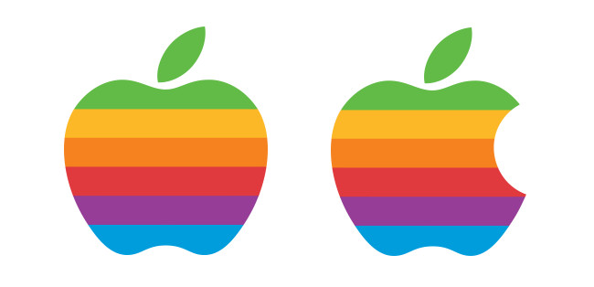
While designing the Apple logo, Janoff created the iconic silhouette of an apple in a form very close to what we’re all familiar with today. In the process, he added a bite mark to You do not have permission to view the full content of this post. Log in or register now. that the fruit depicted in the logo is an apple and not another fruit with a similar silhouette—like a cherry, for example.

Our impression of what the Apple logo would look like without a bite mark (left) vs. the real logo.
Not only does the bite mark imply that the shape represents a fruit you’d typically take a bite out of while eating (as Apples are commonly eaten), but it also gives the apple shape a sense of scale. If you assume the bite came from an ãdül† human mouth, the fruit is too large to be a cherry.
Janoff says the bite mark has no deeper symbolic meaning, and that he was unaware of the computer term “You do not have permission to view the full content of this post. Log in or register now.” while designing the logo. (Also, it has You do not have permission to view the full content of this post. Log in or register now. with Alan Turing.)
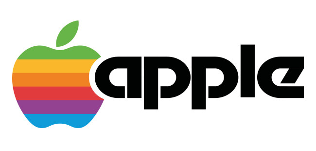
Further playing off the bite mark, Janoff nestled the curvature of the lowercase “A” in the original Apple logotype into the negative space of the apple shape itself. Today, the original lowercase “apple” logotype is long gone, but a similar curvature remains.

Apple Computer, Inc.’s abbreviated logo in 1977, which shipped on the Apple II computer.
The six color bands in the original logo signified the color capabilities of the Apple II computer, which were unique at the time for a computer of its price range. Apple dropped the original six-color logo for a monochrome design in 1998.
Apple Dental Forensics
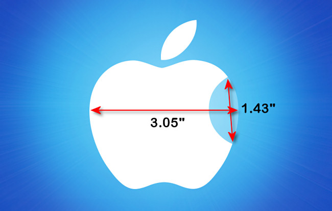
Let’s have a bit of fun. If we assume that the bite mark in the modern Apple logo came from an ãdül† human mouth, we can actually estimate the size of the apple depicted in the logo. This proves nothing useful, but in a world exclusive, How-To Geek can now reveal the size of the official Apple apple.To get the size of the fruit, we need to know how big the bite mark is, and to do that, we need to know the size of a portion of a typical You do not have permission to view the full content of this post. Log in or register now.. A 2005 study found that the average width between first premolars in American adults was about 36.55 mm (if you average the results from men and women together). That’s about 1.43 inches.

If we use that measurement to estimate the size of the apple, we come up with an apple width of about 3.05″ (77.56 mm) across its widest part. According to You do not have permission to view the full content of this post. Log in or register now., Apple growers aim to produce an apple that is 2.75″ to 3.74″ in diameter due to market preferences. So 3.05″ is definitely within the range of an apple.
While this is just a silly exercise, it also shows that while developing the Apple logo, Janoff possibly bit into an apple and measured it to make sure the bite mark was the correct scale for a typical apple. A delicious stroke of genius!
FROM: HOWTOGEEK


 ,madalang lang ako kumain nyan


