- Joined
- Aug 2, 2016
- Posts
- 1,612
- Solutions
- 4
- Reaction
- 635
- Points
- 528
Vector Graphics:The use of geometrical primitives such as points, lines, curves, and shapes or polygon(s), which are all based on mathematical expressions, to represent images in computer graphics. "Vector", in this context, implies more than a straight line.
Vexel Art:Vexel is a neologism for an entirely pixel-based form of raster art that imitates the visual appearance of vector graphics technique (i.e. sharp-edged lines and areas of flat colour or smooth gradient fills). The word itself is a portmanteau derived from a combination of "vector" and "pixel."
Vectoring is, in short, a way to freely illustrate anything. No restrictions; No stocks or renders, no tricks or gimmicks. Vectoring is simply using the tools provided to illustrate anything in any way you want. However vectoring takes a bit of practice and time to master, and it takes practice to learn to use the pentool efficiently. It can also be a frustrating tool to learn as it doesn't always do what you're trying to make it do. You'll find that it's difficult to get perfect curves and that to effectively make use of the tool you have to make a lot of smaller anchor points, rather than large shapes. This guide will mainly focus on vexeling as I will be showing you how I vexel in Photoshop, however the same technique is more or less used across any program that makes use of the pentool.
Before starting, I'm going to define a couple terms in my own words:
Vector: A graphical term referring to the use of the pentool to create geometrical shapes and lines from scratch.
Vexel: Vectoring with pixels; the main difference? You can make a vector as large or as small as you want and resize it over and over again and it'll stay the same quality as when you started. Vexeling is the use of pixels to create shapes, meaning you can't (or at least shouldn't) resize a vexel. Typically vectors are created in Adobe Illustrator where Vexels are created in Photoshop.
Anchor Point: In short, the base of every line created when using the pentool. It does what it name suggests; it anchors the line down to your canvas. Anchor points don't move when you're manipulating your lines, meaning that the end of each created line will stay put. Every time you click with the pentool you create an anchor point. For example, if I were to create a square with the pentool with the least amount of clicks possible I would click where each corner of the square should be.
Pentool: The tool used to vector/vexel. This is the little thing that'll make your anchor points and lines. And, well, everything else.

The pentool: (note that I'm running Cs6, however the pentool has the same appearance and behavior across all versions)

The pentool is a fairly complex tool and can be a bit difficult to use, especially when first starting. The pentool has some pretty complicated mechanics and it's easier to learn the tool yourself than to try to understand my explanation of it, but I'll try to sum it up anyway. Whenever you click with the pentool, you create an anchor point. Those anchor points, not surprisingly, anchor your lines. What does that mean? It means that your anchor points won't move unless you choose to move them. You can manipulate your lines without messing with your anchor points at all, meaning that your line will always have the same length unless the anchor point is moved. I've included links (provided by AnalVoyage) at the end of this section to a more in-depth tutorial on the mechanics of the pentool. Anyways, If you select the pentool and start drawing you'll notice an ugly stroke line and no color within. Once you have the pentool selected, an options box should appear in the top left corner. This box should say either 'Path', 'Pixels, or 'Shape'. Make sure you have this option set to 'shape'. (If you're working in Cs5 or below, there should be three squares in the top left. Choose the one with the boxes in the corners.) To the right of your option box there should be a colored fill box. This is where you choose your color. You can additionally add gradients and patterns within this display. Choose your favorite color and select no stroke and start clicking around with the pentool. You'll notice each anchor point has handles, which you can then drag to create curves. It should look something like this:
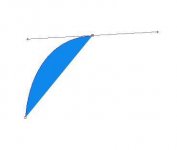
Once you finish creating your shape, press enter to hide the anchor point and silver stroke. Before moving on to the next part, play around with the pen tool a bit and try to get a hang of it's mechanics and behavior.
A series of helpful guides on the mechanics of the pentool: (Thanks to AnalVoyage for providing these links)

Now's the fun part; we're gonna make our own character. Create a simple shape, such as this:
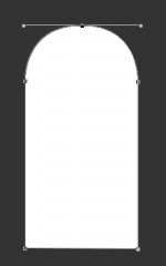
You'll notice how I only have five vector points; One for each straight line, and two for the semicircle. Once your shape is structured, press enter. Now we're going to add a face. This is where you get to be creative. For the sake of this guide I kept mine fairly simple, however you can go crazy. I started with eyes and a mouth along with a bit of fur.

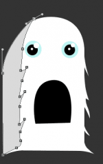
Now that we've got a face, we need to add detail. First of all, we're going to use a clipping mask to add a shadow. Choose a color a shade or two darker than your character's primary color and create a basic shape over around the left side of your character staying true to its shape, right above the simple body layer we made, like so. I shaded some furry lines to add texture however that's not completely necessary.

Go to layer > Create clipping mask (or CTRL+ALT+G) and voila! You've now created a shadow.
Now you should be as creative as possible. We're going to add detail. I held back on this and stayed simple, however you can go crazy and add whatever you'd like: wings, shadows, horns, tails, use your imagination. Make use of the polygon tools as well (circles, squares, etc.) and create something unique to yourself.

As you can see I added a tongue, teeth, shading, little details that make the image look better. We've gone from a few simple shapes to our own character just like that! You can use the same tools and techniques to illustrate anything.

Detail is very important when it comes to a good vector. Balancing detail and simplicity is hard, and seems as if that statement almost contradicts itself. Here are a couple techniques I've either learned or developed on my own.
Thus concludes my guide on vexeling. I hope you learned at least the basics and enjoyed the guide. I'd appreciate any feedback you have or any mistakes on my behalf you'd like to point out. I'll try to update this thread frequently as I come up with more techniques to add or tips to throw in.
If you need any help or have any questions feel free to ask away or contact me via PM or COMMENTING.
Vexel Art:Vexel is a neologism for an entirely pixel-based form of raster art that imitates the visual appearance of vector graphics technique (i.e. sharp-edged lines and areas of flat colour or smooth gradient fills). The word itself is a portmanteau derived from a combination of "vector" and "pixel."
Vectoring is, in short, a way to freely illustrate anything. No restrictions; No stocks or renders, no tricks or gimmicks. Vectoring is simply using the tools provided to illustrate anything in any way you want. However vectoring takes a bit of practice and time to master, and it takes practice to learn to use the pentool efficiently. It can also be a frustrating tool to learn as it doesn't always do what you're trying to make it do. You'll find that it's difficult to get perfect curves and that to effectively make use of the tool you have to make a lot of smaller anchor points, rather than large shapes. This guide will mainly focus on vexeling as I will be showing you how I vexel in Photoshop, however the same technique is more or less used across any program that makes use of the pentool.
Before starting, I'm going to define a couple terms in my own words:
Vector: A graphical term referring to the use of the pentool to create geometrical shapes and lines from scratch.
Vexel: Vectoring with pixels; the main difference? You can make a vector as large or as small as you want and resize it over and over again and it'll stay the same quality as when you started. Vexeling is the use of pixels to create shapes, meaning you can't (or at least shouldn't) resize a vexel. Typically vectors are created in Adobe Illustrator where Vexels are created in Photoshop.
Anchor Point: In short, the base of every line created when using the pentool. It does what it name suggests; it anchors the line down to your canvas. Anchor points don't move when you're manipulating your lines, meaning that the end of each created line will stay put. Every time you click with the pentool you create an anchor point. For example, if I were to create a square with the pentool with the least amount of clicks possible I would click where each corner of the square should be.
Pentool: The tool used to vector/vexel. This is the little thing that'll make your anchor points and lines. And, well, everything else.

The pentool: (note that I'm running Cs6, however the pentool has the same appearance and behavior across all versions)
The pentool is a fairly complex tool and can be a bit difficult to use, especially when first starting. The pentool has some pretty complicated mechanics and it's easier to learn the tool yourself than to try to understand my explanation of it, but I'll try to sum it up anyway. Whenever you click with the pentool, you create an anchor point. Those anchor points, not surprisingly, anchor your lines. What does that mean? It means that your anchor points won't move unless you choose to move them. You can manipulate your lines without messing with your anchor points at all, meaning that your line will always have the same length unless the anchor point is moved. I've included links (provided by AnalVoyage) at the end of this section to a more in-depth tutorial on the mechanics of the pentool. Anyways, If you select the pentool and start drawing you'll notice an ugly stroke line and no color within. Once you have the pentool selected, an options box should appear in the top left corner. This box should say either 'Path', 'Pixels, or 'Shape'. Make sure you have this option set to 'shape'. (If you're working in Cs5 or below, there should be three squares in the top left. Choose the one with the boxes in the corners.) To the right of your option box there should be a colored fill box. This is where you choose your color. You can additionally add gradients and patterns within this display. Choose your favorite color and select no stroke and start clicking around with the pentool. You'll notice each anchor point has handles, which you can then drag to create curves. It should look something like this:

Once you finish creating your shape, press enter to hide the anchor point and silver stroke. Before moving on to the next part, play around with the pen tool a bit and try to get a hang of it's mechanics and behavior.
A series of helpful guides on the mechanics of the pentool: (Thanks to AnalVoyage for providing these links)
- You do not have permission to view the full content of this post.
Log in or register now.
- You do not have permission to view the full content of this post.
Log in or register now.
- You do not have permission to view the full content of this post.
Log in or register now.
- You do not have permission to view the full content of this post.
Log in or register now.
- You do not have permission to view the full content of this post.
Log in or register now.
- You do not have permission to view the full content of this post. Log in or register now.

Now's the fun part; we're gonna make our own character. Create a simple shape, such as this:

You'll notice how I only have five vector points; One for each straight line, and two for the semicircle. Once your shape is structured, press enter. Now we're going to add a face. This is where you get to be creative. For the sake of this guide I kept mine fairly simple, however you can go crazy. I started with eyes and a mouth along with a bit of fur.

Now that we've got a face, we need to add detail. First of all, we're going to use a clipping mask to add a shadow. Choose a color a shade or two darker than your character's primary color and create a basic shape over around the left side of your character staying true to its shape, right above the simple body layer we made, like so. I shaded some furry lines to add texture however that's not completely necessary.

Go to layer > Create clipping mask (or CTRL+ALT+G) and voila! You've now created a shadow.
Now you should be as creative as possible. We're going to add detail. I held back on this and stayed simple, however you can go crazy and add whatever you'd like: wings, shadows, horns, tails, use your imagination. Make use of the polygon tools as well (circles, squares, etc.) and create something unique to yourself.

As you can see I added a tongue, teeth, shading, little details that make the image look better. We've gone from a few simple shapes to our own character just like that! You can use the same tools and techniques to illustrate anything.

Detail is very important when it comes to a good vector. Balancing detail and simplicity is hard, and seems as if that statement almost contradicts itself. Here are a couple techniques I've either learned or developed on my own.
- Drop Shadow: This is an easy technique to add a drop shadow (you know when you're walking around in the sun and there's a shadow in front or behind you? Yeah, those shadows) to your shapes. Duplicate your shape layer and rotate it upside down. Now add a color overlay of a considerable darker hue of your shape's color (Layer>layer style>color overlay). Edit>Transform>Skew and skew your shadow a bit to the right or left according to your light source (all shadows in an image have to face the same way). Change the opacity to around 80-50% and you should have something like this:
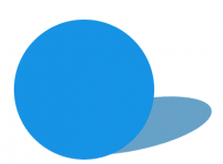
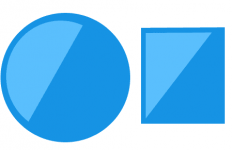
- Glares: I use this particular technique a lot, especially when creating something metallic. It's an extremely simple concept; Take a lighter color and cover up part of the shape with it. It's easier done than explained, so here's an example:

- Layer styles: When vectoring I personally try to stay away from layer styles as much as possible, however they can be useful once you learn to use them the right way. Layer styles can be deadly and ruin your illustration completely if not used right. For example, I used bevel and emboss for my headers in this thread while still managing to keep that simplistic look. A couple layer styles I like to use when vectoring are subtle gradients, Low-opacity strokes, and color overlays. Layer styles you should always stay away from when vectoring are drop shadows, inner shadows, anything that will mess up the vector feel.
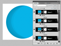
- Fade lighting/shadows: This technique is similar to that of the clipping mask shadow, however it basically just involves more layers. To create a more detailed shadow, use smaller layers of clipping masks and with each layer choose a bit of a darker/lighter hue of color.

- As you can see, this shadow took four layers to create, rather than the usual one layer of shadow. While this technique can sometimes be more appealing it requires a lot of time.
- Tracing/coloring: Refer to this great guide by mjaj to see how he turns his sketches into polished vectors.
Thus concludes my guide on vexeling. I hope you learned at least the basics and enjoyed the guide. I'd appreciate any feedback you have or any mistakes on my behalf you'd like to point out. I'll try to update this thread frequently as I come up with more techniques to add or tips to throw in.
If you need any help or have any questions feel free to ask away or contact me via PM or COMMENTING.
Attachments
-
You do not have permission to view the full content of this post. Log in or register now.


